Admin Dashboard Guide
Introduction
The Admin Dashboard serves as the control center for administrators to view and manage the application's key metrics, user activity, and system statuses. Upon logging in, the admin is presented with an intuitive interface that includes summary cards, charts, reports, and options for managing their profile information.
Dashboard Overview
Once an admin logs into the system, the first thing they will see is the Dashboard, which provides a quick overview of the system’s current status, including user statistics, package details, orders, and support tickets.
Dashboard Layout
The layout consists of two main sections:
-
Navigation Menu (left sidebar): Provides links to various sections of the admin panel, such as:
- Dashboard
- Users
- Packages
- Orders
- Tickets
- Reports
-
Main Dashboard (right section): Displays key metrics in the form of summary cards and visual charts, offering quick insights into the system's status.
At the top of the page, there is a Navbar that contains icons for admin-specific features.
Navbar and Profile Options
At the top-right corner of the admin dashboard, the navbar provides quick access to admin options.
Profile Icon
If the admin has set a profile picture, it will be displayed in the profile icon. Clicking on the profile icon will reveal a dropdown menu with two options:
- Profile: This option allows the admin to update their personal information.
- Logout: This option allows the admin to log out of the system.
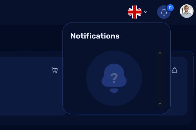
Notification Icon:
The Notification Bell Icon displays all the notifications related to the system. The admin can click on the bell icon to view the latest notifications such as new tickets, orders, user activities, and system alerts. Once the notifications are read, they can be marked as read or dismissed.
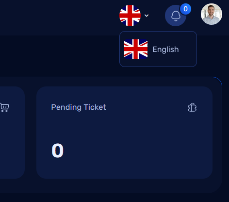
Language Switcher:
The Language Switcher icon allows the admin to select their preferred language for the interface. By clicking on this icon, a dropdown will appear with available language options. The admin can select the language they prefer, and the dashboard interface will automatically update to the chosen language.
Profile Management
Update Your Information:
When the admin clicks on Profile from the dropdown, they are redirected to the profile management page, where they can update their information.
There are two tabs available on this page for updating personal and security details: 1. Basic Information 2. Password Update
1. Basic Information Tab
In the Basic Information tab, the admin can update the following fields:
- Name
- Phone
- Date of Birth (DOB)
- City
- State
- Address
- Gender
The admin can simply update any of the above fields and click the Save button to apply the changes.
2. Password Update Tab:
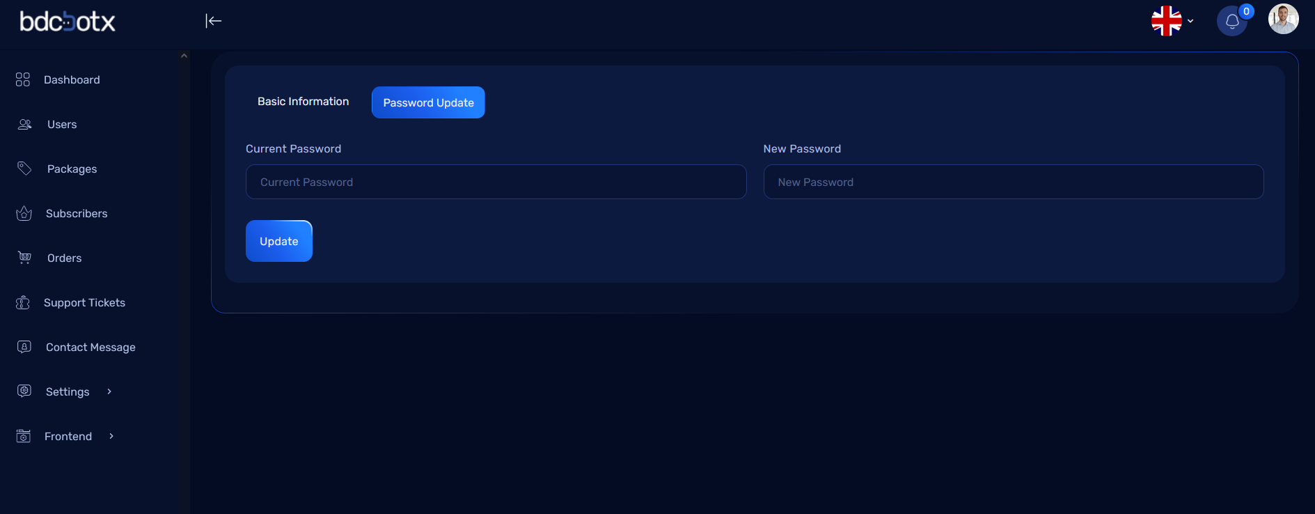
In the Password Update tab, the admin can change their password by providing the following information:
- Current Password: Enter the existing password to verify the identity.
- New Password: Enter the new password (must meet security standards).
- Confirm New Password: Re-enter the new password for confirmation.
Once the fields are completed, the admin can click Update Password to change their password.
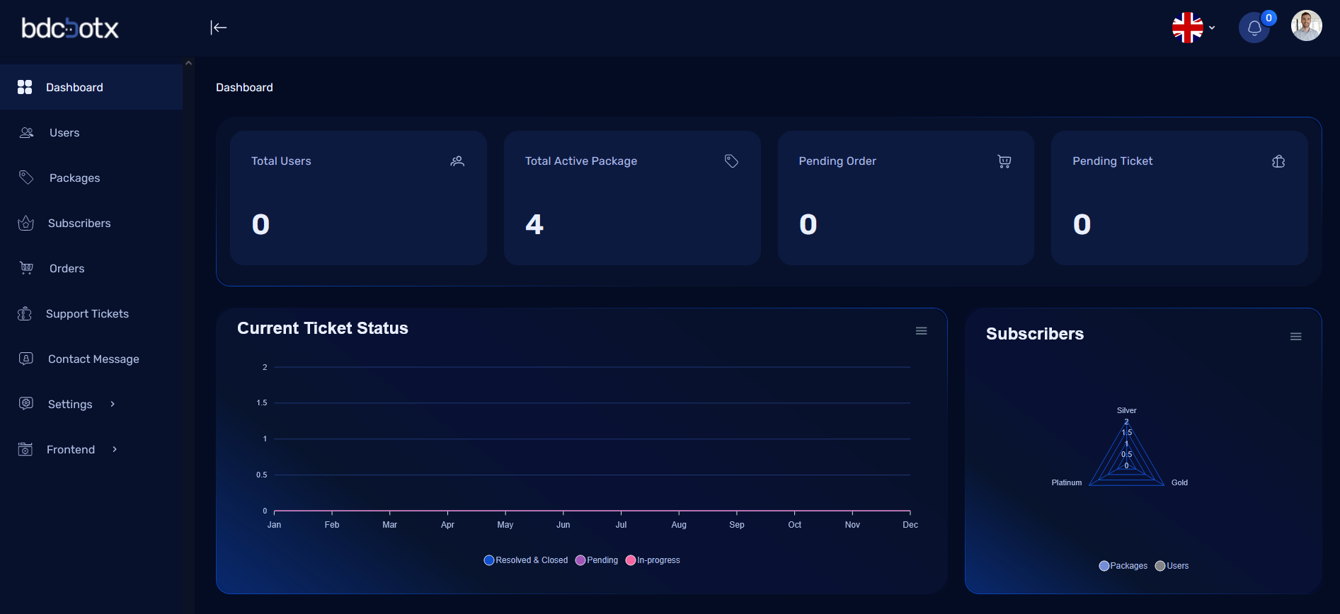
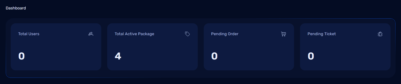
Dashboard Cards
On the main dashboard screen, administrators will see 4 summary cards that represent key metrics of the system. These cards provide a quick overview of important information:
-
Total Users:
- This card displays the total number of registered users in the system. It allows the admin to monitor the size of the user base at a glance.
-
Total Active Packages:
- This card shows how many active packages are currently being used by the users. This helps the admin track which packages are in demand.
-
Pending Orders:
- Displays the number of pending orders that are awaiting approval or processing. This is useful for tracking orders that have not yet been completed or are in a holding status.
-
Pending Tickets:
- This card shows the number of support tickets that are still pending resolution. It provides a quick look at how many tickets are in the support queue and need attention.
- This card shows the number of support tickets that are still pending resolution. It provides a quick look at how many tickets are in the support queue and need attention.
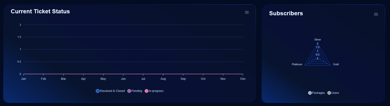
Dashboard Charts
In addition to the summary cards, the admin dashboard includes 2 important charts that visually represent the system’s operational status. These charts help admins understand patterns and trends related to user activity and support tickets.
Current Ticket Status (Chart 1)
- Purpose: This chart displays the status of support tickets in the system. It shows the number of tickets in different states: Pending, Active, Cancelled, Resolved, Closed, and In-progress.
-
Why It’s Useful: This chart allows the admin to track the workload of the support team, monitor the progress of open tickets, and identify if there is any backlog or unresolved issues.
-
Chart Types: Typically, a pie chart or a bar chart can be used to show the distribution of tickets across these statuses.
-
Visualization: The chart will provide a color-coded view of each status, so the admin can easily distinguish between different states of tickets.
-
Subscribers by Package (Chart 2)
- Purpose: This chart displays the distribution of subscribers across different packages. It helps the admin to monitor which packages are popular and identify trends in user subscriptions.
-
Why It’s Useful: By analyzing the chart, the admin can make data-driven decisions to promote certain packages, optimize pricing, or improve the user experience of a particular package.
-
Chart Types: This is usually represented as a bar chart or pie chart to show the number of subscribers per package.
-
Visualization: The chart will display the number of subscribers for each package, with each package represented by a different color or bar. This makes it easy for the admin to understand the relative popularity of each package.
-
Users Management in Admin Dashboard
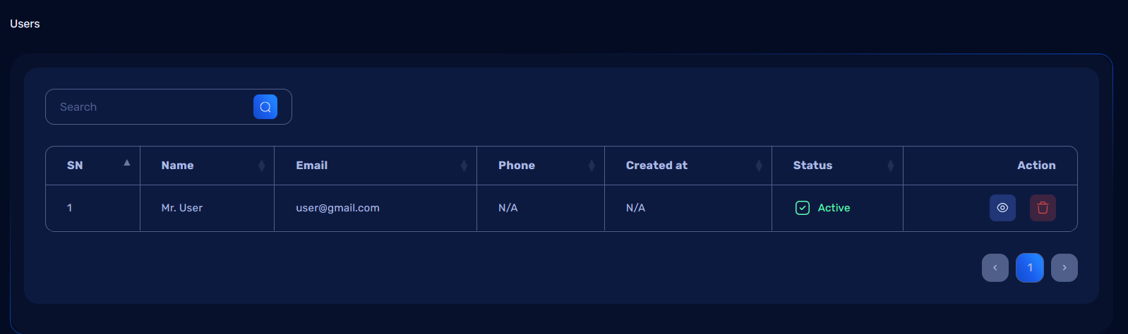
The Users Menu in the admin dashboard allows administrators to view and manage all registered users in the system. This section provides a detailed list of users and options for viewing and deleting user records.
Users List Page
When the admin clicks on the Users Menu from the dashboard, they will be redirected to the Users List Page, which displays all registered users in a tabular format.
Table Structure:
The user table includes the following columns:
- ID: A unique identifier for each user.
- Name: The user's full name.
- Email: The user's email address.
- Phone: The user's contact number (if available).
- Registration Date: The date when the user registered on the system.
- Actions: Buttons for View and Delete actions.
Actions
1. View Button
- Purpose: Displays all details of the selected user on a new page.
- How It Works:
- When the admin clicks the View button, they will be redirected to the User Details Page.
- The page will display the user’s complete profile information, including:
- Name
- Phone
- Date of Birth
- Gender
- Address (City, State, and Full Address)
- Registration Date
- Status (e.g., Active, Inactive)
- and more
2. Delete Button
- Purpose: Permanently deletes the user from the system.
- How It Works:
- When the admin clicks the Delete button, a confirmation dialog will appear asking, "Are you sure you want to delete this user?"
- If the admin confirms, the user record will be deleted from the database.
- A success message will be displayed: "User deleted successfully."
- If the admin cancels, the action will be aborted, and no changes will be made.
Workflow for Managing Users
-
Navigate to the Users Menu:
- From the left-side navigation menu, click on Users.
-
View a User’s Details:
- Locate the desired user in the list and click the View button.
- Review all the information on the User Details Page.
-
Delete a User:
- Locate the user in the list and click the Delete button.
- Confirm the deletion in the confirmation dialog.
- If confirmed, the user will be deleted, and the admin will receive a success notification.
Package Management in Admin Dashboard
The Package Management section allows administrators to add, view, edit, and delete packages available in the system. This feature is essential for managing subscriptions or offerings provided to users.
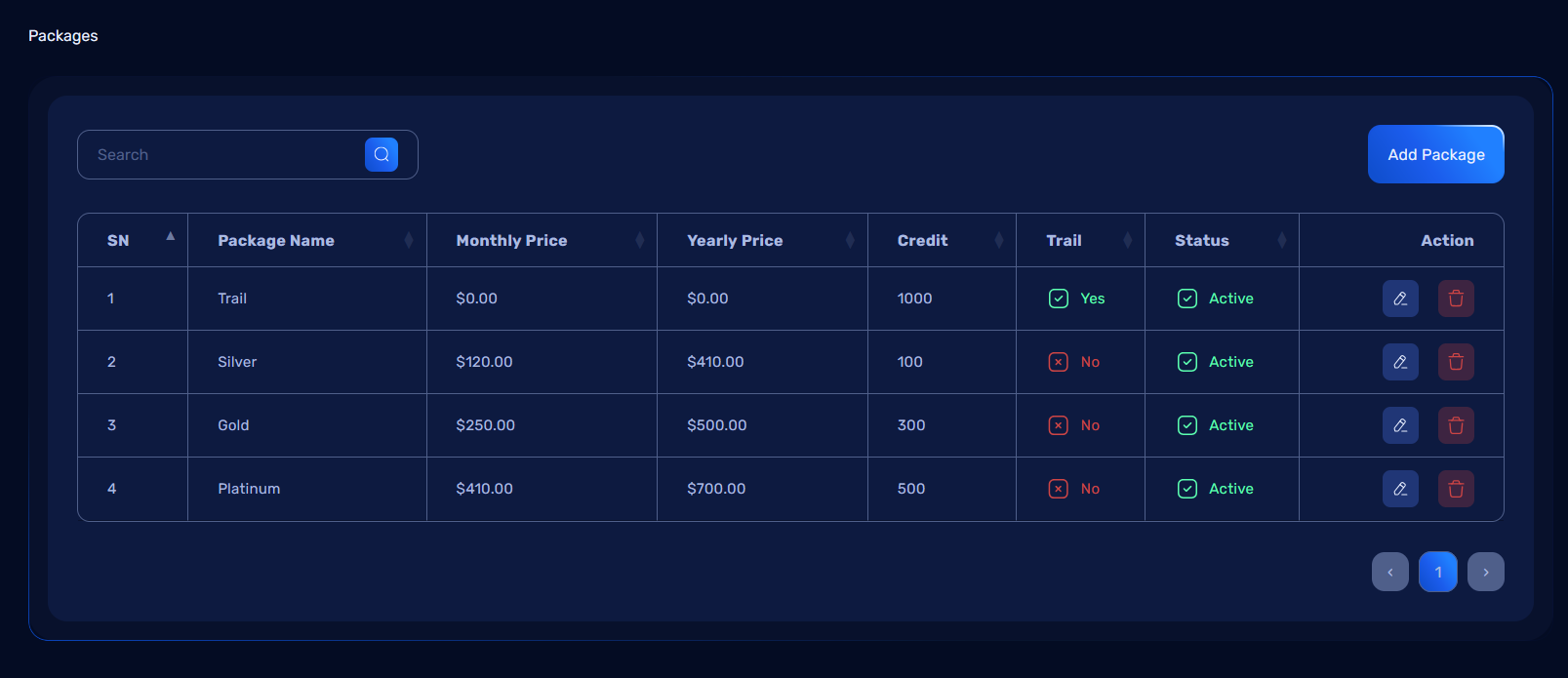
Package List Page
When the admin navigates to the Packages Menu, they are presented with a table displaying all existing packages.
Table Structure:
The table includes the following columns:
- ID: A unique identifier for each package.
- Package Name: The name of the package.
- Monthly Price: The cost of the package for a monthly subscription.
- Yearly Price: The cost of the package for an annual subscription.
- Is Trial: Indicates whether the package is a trial package (Yes/No).
- Actions: Buttons for Edit and Delete actions.
Add Package
Add Package Button:
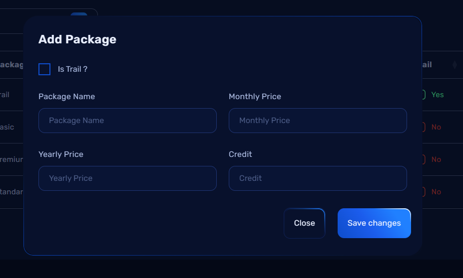
On the top-right corner of the Package List Page, there is an Add Package button. Clicking this button opens a modal where the admin can input details about a new package.
Add Package Modal
The Add Package Modal allows the admin to add new packages to the system with the following fields:
-
Package Name: Enter the name of the package (e.g., "Basic Plan").
-
Monthly Price: Enter the cost of the package for a monthly subscription (e.g., "$10"). For trial packages, this can be set to "Free".
-
Yearly Price: Enter the cost of the package for an annual subscription (e.g., "$100"). For trial packages, this can be set to "Free".
-
Is Trial: A checkbox to indicate if the package is a trial package. If checked, the monthly and yearly prices can be set to "Free".
Modal Actions:
-
Save Button: Click to save the new package details to the system.
-
Cancel Button: Click to close the modal without saving the new package.
This modal allows the admin to easily add new packages to the system, define monthly and yearly subscription costs, and mark packages as trial offerings.
How It Works:
- The admin fills in the required details and clicks Submit.
- If valid, the package is added to the system and displayed in the package list.
- A success message will confirm: "Package added successfully."
Actions
- Edit Button:
- Purpose: Update the details of an existing package.
-
How It Works:
- Clicking the Edit button opens a modal similar to the Add Package modal, pre-filled with the package’s current information.
- The admin can modify the details and click Submit to save changes.
- A success message will confirm: "Package updated successfully."
-
Delete Button:
- Purpose: Remove a package from the system.
- How It Works:
- Clicking the Delete button shows a confirmation dialog: "Are you sure you want to delete this package?"
- If confirmed, the package is deleted, and a success message appears: "Package deleted successfully."
- If canceled, no changes are made.
Workflow for Managing Packages
- View Existing Packages:
- Navigate to the Packages Menu.
-
Review the details in the package table.
-
Add a New Package:
- Click the Add Package button.
- Fill in the package details in the modal form.
-
Click Submit to add the package.
-
Edit an Existing Package:
- Click the Edit button for the desired package.
- Modify the necessary fields in the modal.
-
Click Submit to save changes.
-
Delete a Package:
- Click the Delete button for the package.
- Confirm the action in the confirmation dialog.
Subscriber Management in Admin Dashboard
The Subscriber Management section allows administrators to view, filter, and manage subscribers based on their subscription status. It provides a comprehensive view of all subscribers and tools to interact with specific groups, such as sending reminder emails to those whose subscriptions are nearing expiry.
Subscriber Page Overview
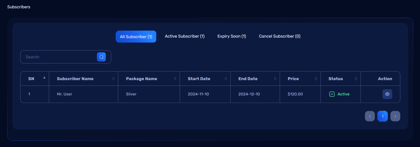
The Subscriber Page contains four tabs to categorize subscribers:
- All: Displays a complete list of all subscribers.
- Active: Lists subscribers with active subscriptions.
- Expiry Soon: Shows subscribers whose subscriptions are close to expiring, with an option to send reminder emails.
- Cancel: Displays subscribers whose subscriptions have expired.
Tabs and Their Features
1. All Tab
- Description: Displays all subscribers, regardless of their subscription status.
- Columns:
- ID: Unique identifier for the subscriber.
- Name: Full name of the subscriber.
- Email: Subscriber's email address.
- Package: The subscribed package.
- Status: Current status (Active, Expiry Soon, or Canceled).
- Actions: Includes a View button.
2. Active Tab
- Description: Displays subscribers with active subscriptions.
- Columns:
- Same as All Tab.
3. Expiry Soon Tab
- Description: Lists subscribers whose subscriptions are close to expiry.
- Special Feature:
- Email Button: Each subscriber in this tab has an Email button. Clicking this button allows the admin to send a reminder email to the subscriber about renewing their subscription.
- Columns:
- Same as All Tab, with an additional Email action button.
4. Cancel Tab
- Description: Displays subscribers whose subscriptions have expired.
- Columns:
- Same as All Tab.
Actions for All Tabs
- View Button:
- Purpose: Opens a detailed profile page for the subscriber, showing all their information, including:
- Name, Email, Phone, Subscription Start Date, End Date, and Status.
- Package details.
-
Workflow:
- Click the View button.
- The system redirects to the subscriber detail page.
-
Email Button (Expiry Soon Tab):
- Purpose: Sends a reminder email to subscribers whose subscriptions are close to expiry.
- Workflow:
- Click the Email button next to the subscriber's name.
- The system sends a pre-defined renewal reminder email.
- A confirmation message appears: "Reminder email sent successfully."
Workflow for Subscriber Management
- View All Subscribers:
- Navigate to the Subscriber Menu.
-
Review the list under the All Tab.
-
Manage Active Subscribers:
-
Click on the Active Tab to see all active subscribers.
-
Send Reminder Emails:
- Click the Expiry Soon Tab to see subscribers nearing expiry.
-
Use the Email Button to send renewal reminders.
-
Review Expired Subscriptions:
- Click on the Cancel Tab to see all expired subscriptions.
- Review subscriber details using the View Button.
Summary
The Subscriber Management section provides an organized way to view and interact with subscribers based on their subscription status. Features include: - Easy categorization into All, Active, Expiry Soon, and Cancel tabs. - Actions like viewing details and sending renewal reminders. - A user-friendly interface to streamline subscription management tasks.
Order Management in Admin Dashboard
The Order Management section allows administrators to view and manage all user orders efficiently. Orders are categorized into three tabs for easier navigation: Pending, Success, and Cancel. Each tab includes actions to view or manage orders as needed.
Order Page Overview
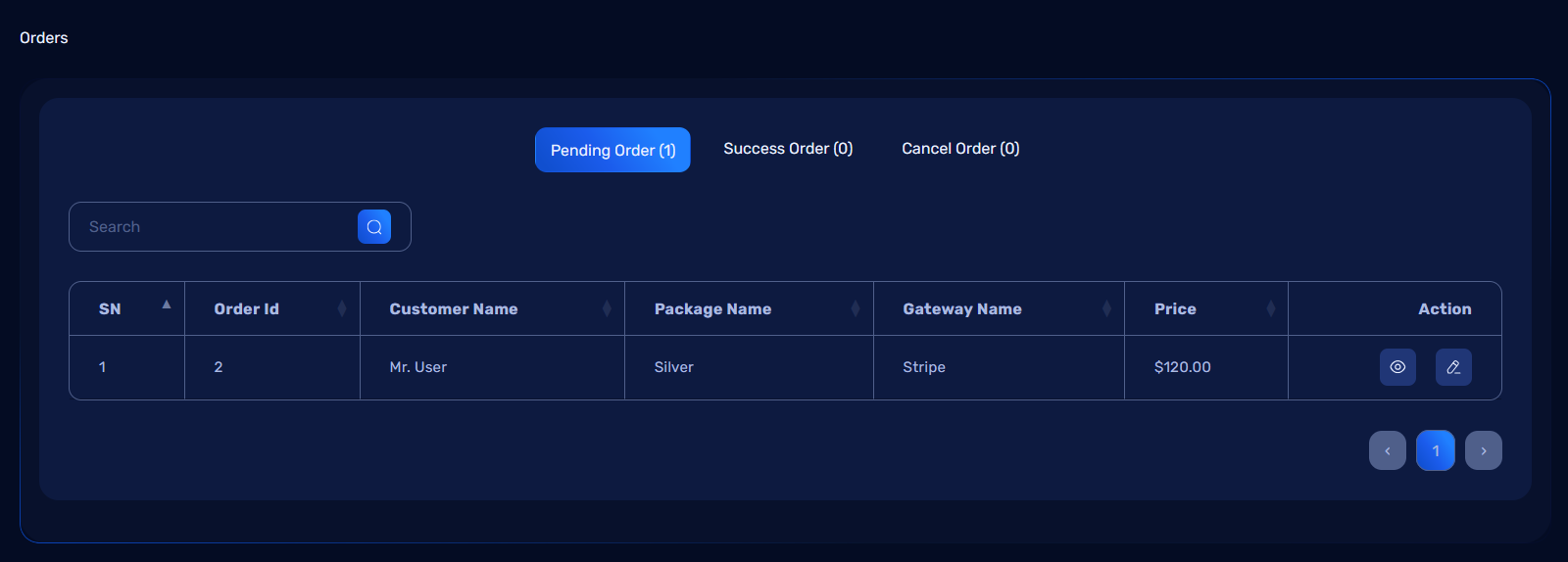
The Order Page consists of three tabs, each displaying a specific type of order:
- Pending: Displays orders that are yet to be processed.
- Success: Shows orders that have been successfully completed.
- Cancel: Lists orders that have been canceled.
Each tab contains a View button to display detailed information about the order. The Pending Tab includes an additional Edit button for processing orders.
Tabs and Their Features
1. Pending Tab
- Description: Contains orders awaiting action from the admin.
- Actions:
- View: Opens a detailed view of the order, including user details, items purchased, total amount, and payment status.
- Edit: Allows the admin to process the order by marking it as:
- Success: To complete the order.
- Cancel: To reject or terminate the order.
2. Success Tab
- Description: Displays all orders that have been successfully processed.
- Actions:
- View: Opens the order details.
3. Cancel Tab
- Description: Contains all orders that have been canceled.
- Actions:
- View: Opens the order details.
Pending Tab: Edit Workflow
The Edit button in the Pending Tab allows the admin to update the order status.
Steps to Edit an Order:
- Navigate to the Pending Tab in the Order Page.
- Locate the order you want to edit and click the Edit button.
- A modal or new page opens, displaying the order details and options to update the status.
- Choose one of the following actions:
- Mark as Success:
- The order is marked as successful and moved to the Success Tab.
- A confirmation message appears: "Order successfully marked as completed."
- Mark as Cancel:
- The order is marked as canceled and moved to the Cancel Tab.
- A confirmation message appears: "Order successfully canceled."
- Mark as Success:
- Click Save Changes to finalize the status update.
Summary
The Order Management section simplifies the process of managing user orders. Its organized layout and actionable tabs provide the following benefits: - Quick access to Pending, Success, and Cancel orders. - Easy order status updates via the Edit button in the Pending Tab. - Detailed order information available with the View button in all tabs.
This section ensures efficient order tracking and streamlined workflows for administrators.
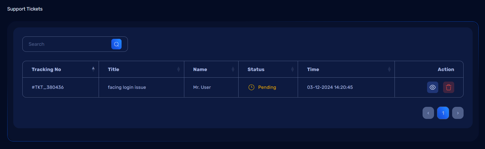
Support Ticket Management in Admin Dashboard
The Support Ticket Management section allows administrators to view, manage, and resolve support tickets submitted by users. This feature ensures effective communication between users and the admin to address issues promptly.
Support Ticket Overview
All tickets created by users are displayed in a table format on the Support Ticket page. The page includes essential actions for handling tickets effectively, such as viewing details, changing statuses, chatting with users, and deleting tickets.
Actions Available:
- View: Opens a detailed page for the selected ticket.
- Delete: Removes the ticket from the system.
View Support Ticket
When the admin clicks the View button for a ticket, they are redirected to a detailed ticket management page. Here, the admin can perform the following actions:
1. Change Ticket Status
Admins can update the status of the ticket to reflect its current progress. Available statuses may include: - Pending - In Progress - Resolved - Closed - Hold - Cancel
To update the status: 1. Select the desired status from the dropdown or button group. 2. The status change is saved automatically, and a confirmation message appears.
2. Chat with Users
Admins can communicate directly with the user who created the ticket. The chat interface allows real-time messaging and ensures clear communication regarding the issue.
Features of the Chat Interface:
- Real-Time Messaging: Both admin and user messages are displayed instantly.
- Message Deletion: If the admin sends a message by mistake, it can be deleted by clicking a delete icon next to the message.
- File Sharing: Admins can upload and share files with the user, such as screenshots, documents, or instructions.
Steps to Chat:
- Type your message in the input field at the bottom of the chat window.
- Optionally, attach a file using the upload button.
- Press Send to deliver the message.
- If a message needs to be removed, click the Delete Icon next to the message.
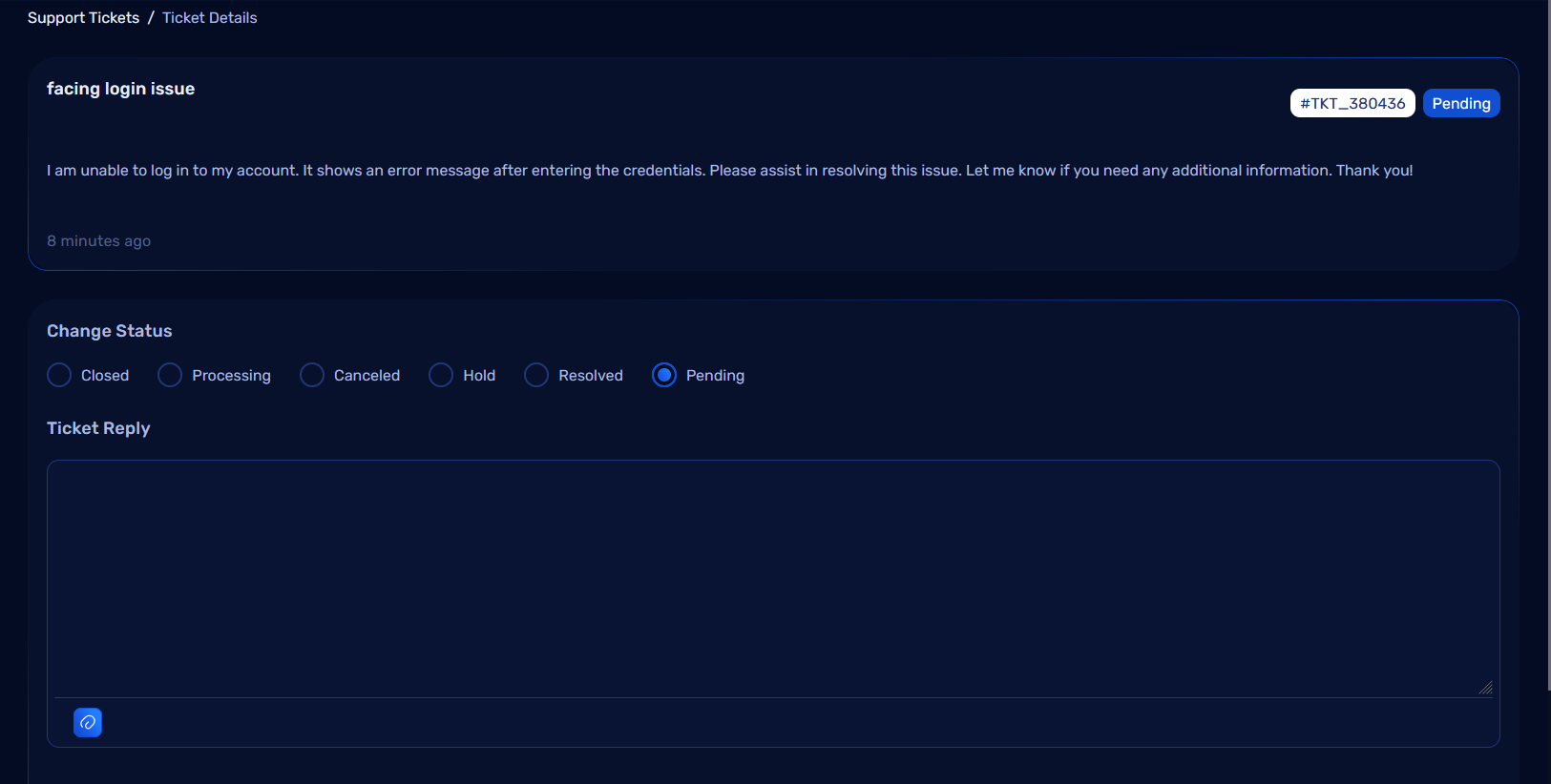
3. Resolve Ticket
Once the user's issue is resolved:
- Update the ticket status to Resolved.
- Notify the user through the chat if required.
- Close the ticket by marking it as Closed.
Resolving and closing tickets helps maintain an organized workflow and ensures that completed issues are tracked.
4. Delete Ticket
If a ticket is no longer needed (e.g., duplicate or irrelevant), the admin can delete it directly from the ticket list.
Steps to Delete a Ticket:
- Click the Delete button next to the ticket in the table.
- Confirm the deletion in the pop-up dialog.
- The ticket is permanently removed from the system.
Summary
The Support Ticket Management section streamlines the process of addressing user concerns with features such as:
- Viewing and managing ticket details.
- Chatting directly with users to resolve issues.
- File sharing for better communication.
- Efficient status updates and ticket resolution.
This system ensures a smooth support workflow, enabling admins to manage tickets effectively and improve user satisfaction.
General Settings Management in Admin Dashboard
The General Settings section in the admin dashboard allows administrators to configure and update the application's basic information, such as the app name, author name, contact details, logos, favicon, and more. These settings are saved both in the database and updated in the .env file for seamless application configuration.
General Settings Overview
Key Features:
- Update core app information like name, author, contact details, and branding assets.
- Store the settings in the database for easy retrieval.
- Automatically update the .env file to reflect changes made in the settings.
General Settings Form
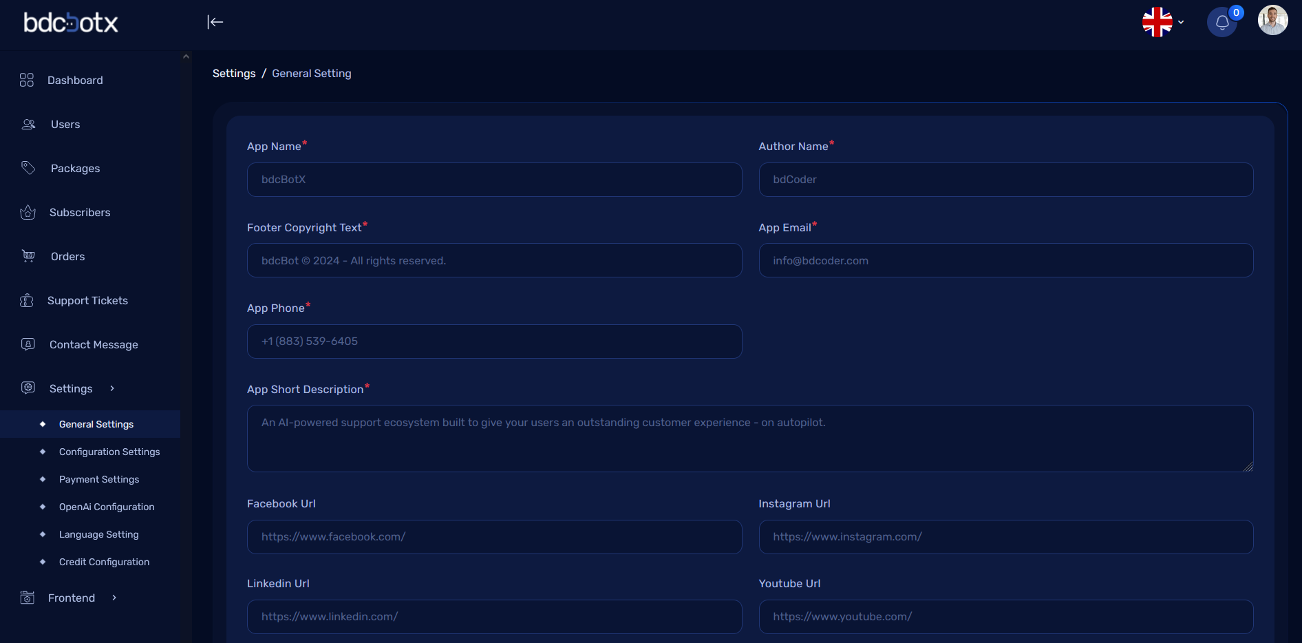
How It Works
1. Submitting the Form:
- Admin enters or updates the required fields in the form.
- After clicking the Submit button:
- The updated values are stored in the database.
- Corresponding keys in the
.envfile are updated automatically.
Settings Configuration in Admin Dashboard
The Settings section in the admin dashboard allows administrators to configure various aspects of the application, including basic settings, email configuration, social login settings, and reCAPTCHA configuration for enhanced security.
Basic Configuration
The Basic Configuration section contains the following settings:
1. Preloader:
- Purpose: Allows the admin to enable or disable the preloader that appears during the loading of the application.
- Options:
Enable: Show preloader during page loading.Disable: Hide preloader.
2. Language Switcher:
- Purpose: Allows the admin to enable or disable the language switcher that enables users to change the language of the application.
- Options:
Enable: Users can switch between available languages.Disable: Language switcher is not visible to users.
3. Enable Front-End Status:
- Purpose: Allows the admin to show or hide the landing page of the application.
- Options:
Enable: The landing page is visible to users.Disable: The landing page is hidden from users.
Email Configuration
The Email Configuration section allows the admin to set up email delivery settings for the application.
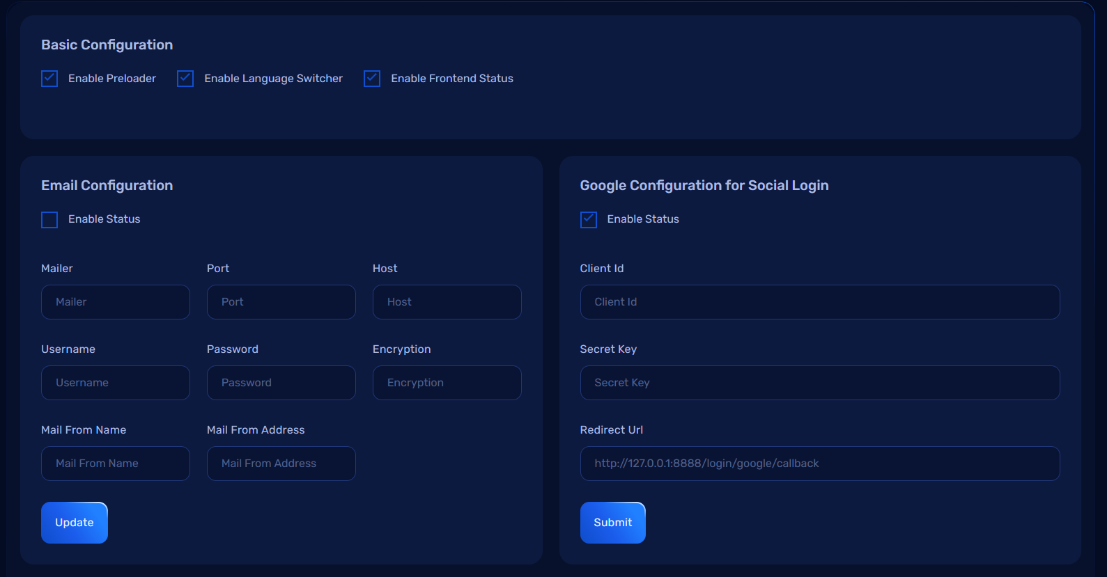
Form Fields:
-
Mailer: Defines the mailer service to be used (e.g., SMTP).
-
Port: Defines the port to be used for the mailer.
-
Host: Specifies the mail server host address.
-
Username: The username for the mail server.
-
Password: The password for the mail server.
-
Encryption: Defines the encryption protocol for the mailer (e.g., TLS, SSL).
-
Mail From Name: Defines the sender's name used in outgoing emails.
-
Mail From Address: Defines the sender's email address for outgoing emails.
Google Configuration for Social Login
The Google Configuration for Social Login section allows the admin to configure Google OAuth credentials for enabling Google-based social login.
Facebook Configuration for Social Login
The Facebook Configuration for Social Login section allows the admin to configure Facebook OAuth credentials for enabling Facebook-based social login.
Recaptcha Configuration for v3
The Recaptcha Configuration for v3 section allows the admin to configure Google reCAPTCHA v3 for preventing bots from submitting forms.
How It Works
1. Submitting the Settings Form:
- Admin enters or updates the required fields in the form.
- After clicking the Submit button:
- The updated settings are stored in the database.
- Corresponding keys in the
.envfile are updated automatically.
Payment Settings Configuration in Admin Dashboard
The Payment Settings section in the admin dashboard allows administrators to configure and manage payment gateway integrations, including PayPal, Stripe, Mollie, and Paystack. These settings enable the application to process payments through these gateways. Admins can enable or disable each payment method and select between sandbox or live modes for testing or production environments.
Payment Gateways Configuration
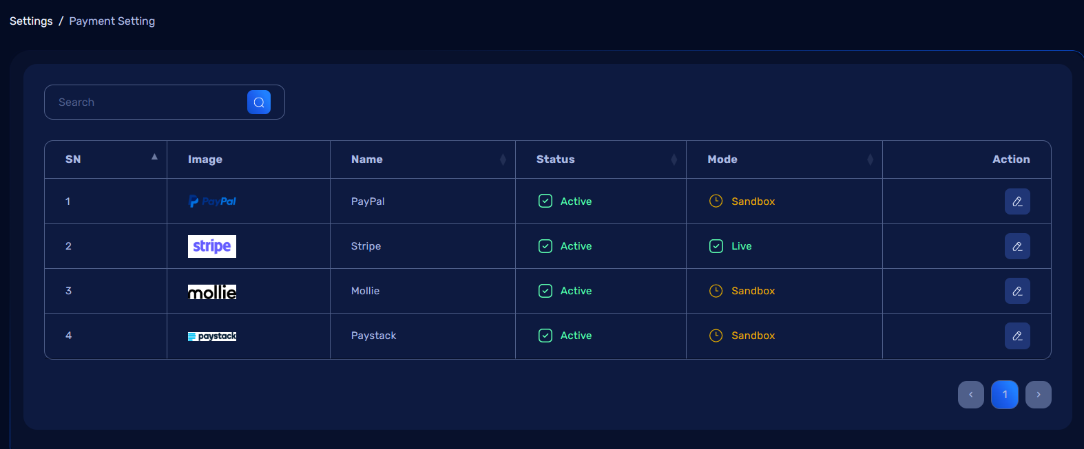
1. PayPal Configuration
- Action: Configure PayPal
- Settings:
- Client ID and Secret Key for PayPal integration.
- Status: Enable or Disable PayPal gateway.
- Mode: Select between Sandbox or Live for testing or production.
2. Stripe Configuration
- Action: Configure Stripe
- Settings:
- Publishable Key and Secret Key for Stripe integration.
- Status: Enable or Disable Stripe gateway.
- Mode: Select between Sandbox or Live for testing or production.
3. Mollie Configuration
- Action: Configure Mollie
- Settings:
- API Key for Mollie integration.
- Status: Enable or Disable Mollie gateway.
- Mode: Select between Sandbox or Live for testing or production.
4. Paystack Configuration
- Action: Configure Paystack
- Settings:
- Public Key and Secret Key for Paystack integration.
- Status: Enable or Disable Paystack gateway.
- Mode: Select between Sandbox or Live for testing or production.
How It Works
1. Submitting the Payment Configuration Form:
- Admin enters or updates the required fields for each payment gateway.
- After clicking the Submit button:
- The updated settings are stored in the database.
- The corresponding payment gateway configurations are updated.
OpenAI Configuration in Admin Dashboard
The OpenAI Configuration section in the admin dashboard allows administrators to configure and manage the OpenAI API integration. This includes setting the model, providing the secret key, and adjusting the character limit for API calls.
OpenAI Configuration Settings
1. Model Selection
- Action: Select the OpenAI model to be used for processing requests.
- Options: Different available models based on your OpenAI subscription.
2. Secret Key
- Action: Configure the OpenAI API secret key to authenticate requests.
- The key is required for connecting the application with OpenAI services.
3. Character Limit
- Action: Set the character limit for the OpenAI model.
- Admin can define the maximum number of characters allowed per API request, which is useful for optimizing performance and controlling cost.
How It Works
1. Submitting the OpenAI Configuration Form:
- Admin enters or updates the model, secret key, and character limit.
- After clicking the Submit button:
- The updated configuration is stored in the database.
- The
.envfile is updated with the new values.
Multi Language Setting in Admin Dashboard
The Multi Language Setting section in the admin dashboard allows administrators to manage the available languages in the application. Admins can add new languages, edit existing ones, or delete unwanted languages. They can also set a default language for the application.
Multi Language Settings Overview
Features:
- Add new languages by specifying the language name, ISO code, and uploading a flag image.
- Set any language as the default language for the application.
- Edit existing languages, update their details, or delete them.
- Translate content for specific languages.
Managing Languages
1. Add Language
- Action: Click on Add Language to create a new language entry.
- Fields to Provide:
- Name: Name of the language (e.g., English, Spanish).
- ISO Code: ISO 639-1 code for the language (e.g., en, es).
- Flag Image: Upload an image file for the flag that represents the language.
- Make as Default: Option to set this language as the default language for the application.
- Fields to Provide:
2. Existing Languages List
- The list will display the following details for each language:
- Language name
- ISO code
- Flag image
- Default status (whether it is the default language or not)
Actions for Each Language
Each language entry has the following actions:
-
Translate:
- Action: Clicking the Translate button allows the admin to translate content into the selected language.
- Purpose: Admin can translate text, labels, and other content to match the chosen language.
-
Edit:
- Action: Clicking the Edit button opens a form to modify the language's details, such as the name, ISO code, or flag image.
-
Delete:
- Action: Clicking the Delete button will remove the language from the list, ensuring the language is no longer available in the application.
How It Works
1. Adding a New Language:
- Admin clicks on Add Language, fills in the required details, and clicks Submit.
- The language name, ISO code, flag image, and default status are saved in the database.
- The system will automatically update language files for the newly added language.
2. Editing a Language:
- Admin clicks on Edit for the language they want to modify.
- The form opens with the current language details, allowing the admin to update the name, ISO code, or flag image.
3. Deleting a Language:
- Admin clicks on Delete for the language they want to remove.
- The language is permanently removed from the database, and it will no longer be available in the application.
4. Default Language:
- Admin can set any language as the default language by checking the Make as Default checkbox when adding or editing a language.
- The default language will be the primary language used by the system and will be displayed to users unless they choose a different language.
Credit Configuration Settings in Admin Dashboard
The Credit Configuration Settings section in the admin dashboard allows administrators to configure the credit system for various actions within the application. Admins can set credit values for individual actions such as per conversation, URL usage, plain text content, and removing branding.
Credit Configuration Overview
Features:
- Set credit values for various user actions.
- Configure how credits are used for specific functionalities (e.g., per conversation, individual URLs).
- Manage the actions for which credits are required, such as removing branding, using plain text, and more.
Available Actions & Settings
1. Per Conversation Credit
- Description: This setting determines the amount of credit deducted for each conversation or interaction a user initiates.
- Usage: The credit value is subtracted when a user starts a new conversation, for example, in a chatbot or a support system.
2. Individual URL Credit
- Description: This setting allows you to specify the credit value for users to access an individual URL or resource.
- Usage: If a user requests a specific URL, the configured credit amount will be deducted.
3. Individual Plain Text Credit
- Description: This setting defines the credit value required to access plain text content or messages.
- Usage: If a user wants to view or interact with plain text content, the set credit value will be deducted.
4. Remove Branding Credit
- Description: This setting allows users to remove branding (logos, watermarks, etc.) from the application or content.
- Usage: Users will need to pay a specified amount of credit to remove branding from the output, such as from reports, documents, or media content.
How It Works
1. Setting Credits for Actions:
- Admins can configure the credit values for each of the actions listed above.
- For each action, admins can specify a credit amount that will be deducted when a user performs that action.
Website Configuration in Admin Dashboard
The Website Configuration section allows administrators to manage the content and settings for the landing page of the website. This includes updating the various sections of the landing page to reflect the desired information.
Website Configuration Overview
Features:
- Manage the content displayed on the landing page.
- Customize sections like the hero section, including the slogan, title, animation text, and short description.
- Easy to update the key elements that visitors will see when they land on the website.
Hero Section Configuration
The Hero Section is one of the first things a user sees when they visit the website. In this section, the following data can be updated:
Fields to Update:
-
Slogan:
- A short and catchy phrase that represents the core message or value of the website or application.
-
Title:
- The main title of the hero section, which briefly describes the service or product offered.
-
Animation Text:
- A dynamic text that appears with animation or transition effects, adding an interactive element to the hero section.
-
Short Description:
- A brief description providing more context or details about the app or service.
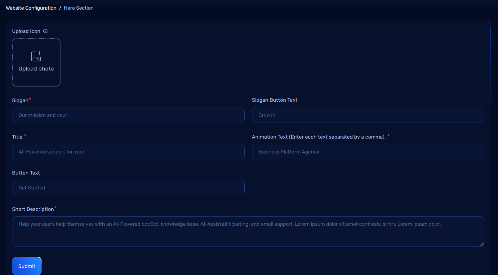
How It Works
1. Updating the Hero Section Content:
- Admins can input or modify the content for the Slogan, Title, Animation Text, and Short Description as needed.
- After entering the updated information, the changes will be applied to the landing page, and the sections will reflect the new content.
About Section Configuration in Admin Dashboard
The About Section on the website provides an opportunity to introduce the application or business and give users an understanding of its purpose and values. In this section, administrators can update the essential details such as the title, description, preview image, and video link.
About Section Overview
Features:
- Update the title, short description, and other media in the About section.
- Easily customize the content that tells visitors about the product or service.
- Allows for visual enhancements with an image and video.
About Section Configuration
The About Section contains the following fields that can be updated:
Fields to Update:
-
Title:
- The main heading of the About section.
-
Short Description:
- A brief and engaging description that explains what the website, company, or service is all about.
-
Preview Image:
- An image that visually represents the business or service, providing a visual context for the content.
-
Video Link:
- A link to an embedded video that explains more about the product, service, or company.
How It Works
1. Updating the About Section Content:
- Admins can update the Title, Short Description, Preview Image, and Video Link.
- After submitting the changes, the content will be reflected in the About section of the landing page.
Feature Section Configuration in Admin Dashboard
The Feature Section allows administrators to showcase the core features or functionalities of the application or service. In this section, different types of features can be added with titles, descriptions and images to highlight key aspects of the product.
Feature Section Overview
Features:
- Add multiple feature types to highlight the strengths of the product or service.
- Customize the title, description, icon, and image for each feature.
- Organize features in a clear and engaging way to attract user attention.
Feature Section Configuration
The Feature Section provides the flexibility to highlight various features of your application or service. This section is divided into multiple tabs, each serving a specific purpose to manage and configure different aspects of the features.
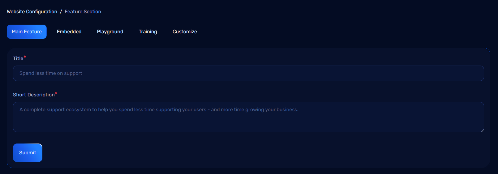
Tabs in the Feature Section
1. Main Feature Tab
This tab allows you to configure the primary settings for the feature section.
Fields to Update:
- Title: Define the overarching title for the main feature section.
- Description: Provide a brief introduction or overview of what the feature section entails.
Fields to Update for Each Feature Item:
- Title: Specify the name of the feature being showcased.
- Description: Add a concise explanation of the feature to inform users.
- Icon/Preview Image: Optionally upload an icon or image to visually represent the feature.
2. Embedded Tab Configuration
In the Embedded tab, you can manage the visibility and content of embedded features.
Fields to Update:
- Title: Set the name of the embedded feature.
- Short Description: Provide a brief description of the feature.
- Preview Image: Upload an image to represent the embedded feature.
- Status: Toggle the visibility of the feature (Show/Hide).
By updating these fields, you can control which embedded features are visible to users.
Embedded Features Tab
This tab is dedicated to managing features related to embedded tools or integrations.
Fields to Update:
- Title: Define the name of the embedded feature.
- Short Description: Include details about the embedded functionality.
- Icon/Preview Image: Optionally upload an icon or image to visually represent the feature.
4. Playground Tab Configuration
In the Playground tab, you can manage the visibility and content of playground features.
Fields to Update:
- Show/Hide Status: Toggle the visibility of the playground (Show/Hide).
- Title: Set the name of the playground feature.
- Short Description: Provide a brief description of the playground feature.
- Playground Items: Add specific items or components that belong to the playground.
By configuring these fields, you can control which playground features are visible and editable by users.
5. Training Tab Configuration
In the Training tab, you can manage the visibility and content of training features.
Fields to Update:
- Show/Hide Status: Toggle the visibility of the training feature (Show/Hide).
- Title: Set the name of the training feature.
- Short Description: Provide a brief description of the training feature.
- Training Items: Add specific items or components related to the training.
This allows you to easily control which training features are visible and editable for users.
6. Customize Tab Configuration
In the Customize tab, you can configure the appearance and content of the feature.
Fields to Update:
- Left Image: Upload or select an image to display on the left side of the feature.
- Right Image: Upload or select an image to display on the right side of the feature.
- Show/Hide Status: Toggle the visibility of the customize feature (Show/Hide).
- Title: Set the title or name of the customization feature.
- Short Description: Provide a brief description of the customization feature.
This allows you to customize the layout and visibility of the feature with the necessary details.
Pricing Section Configuration in Admin Dashboard
In the Pricing Section, you can configure the visibility and content for each pricing package.
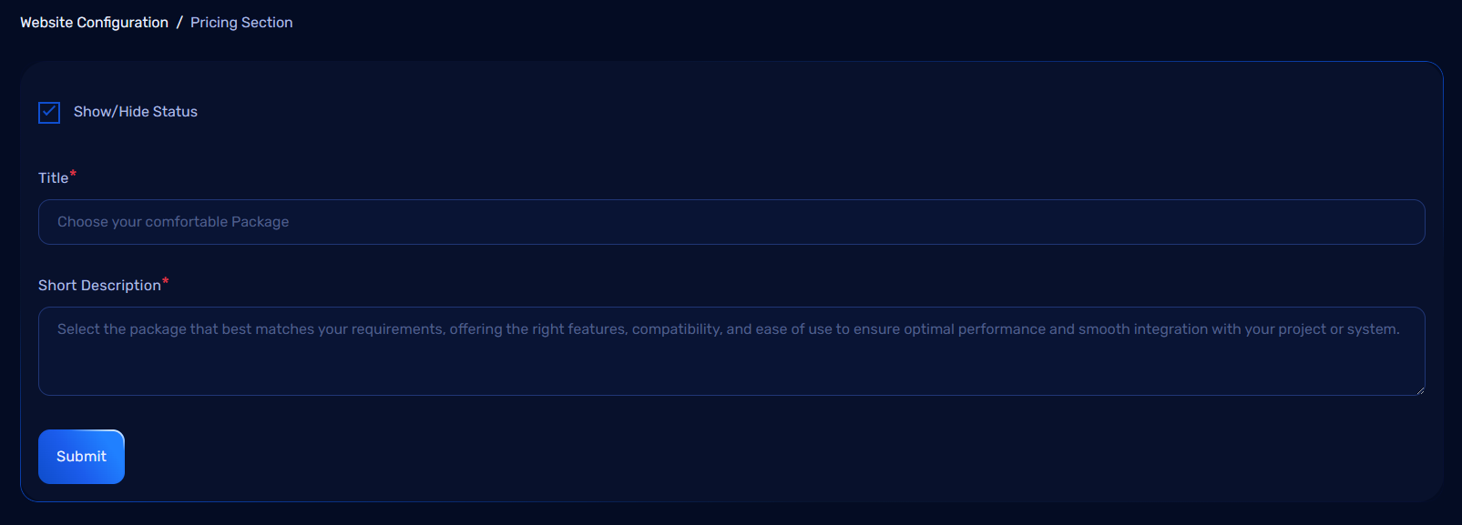
Fields to Update:
- Show/Hide Status: Toggle the visibility of the pricing section (Show/Hide).
- Title: Set the title for the pricing section.
- Short Description: Provide a brief description of the pricing section.
This configuration allows you to control the visibility and presentation of the pricing section on your website.
Blog Section Configuration in Admin Dashboard
The Blog Section allows administrators to manage and display blog posts on the website. This section is used to add, update, or delete blog entries and make them available for users to read. Administrators can organize blog posts and control the visibility of each post.
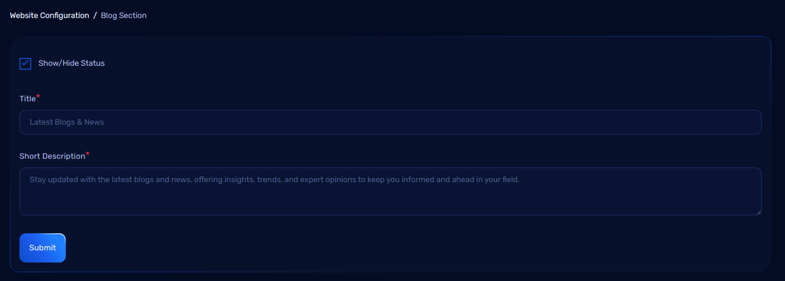
Blog Configuration Fields
The Blog Section can be configured with the following fields:
1. Blog Post Information:
- Title: The main title of the blog post.
- Content: The main body or article of the blog post.
- Image: A featured image for the blog post that represents the content visually.
How It Works
1. Adding a New Blog Post:
- Admins can add a new blog post by filling in the required details.
- Once saved, the blog post will either be published or saved as a draft, depending on the status.
Managing Blog Posts
1. Edit and Delete:
- Admins can edit or delete blog posts by accessing the Actions column in the blog post list.
- Edit: Modify the blog post content, title, image.
- Delete: Permanently remove the blog post from the system.
Let's Go Section Configuration
In the Let's Go Section, you can configure the visibility and content with the following fields:
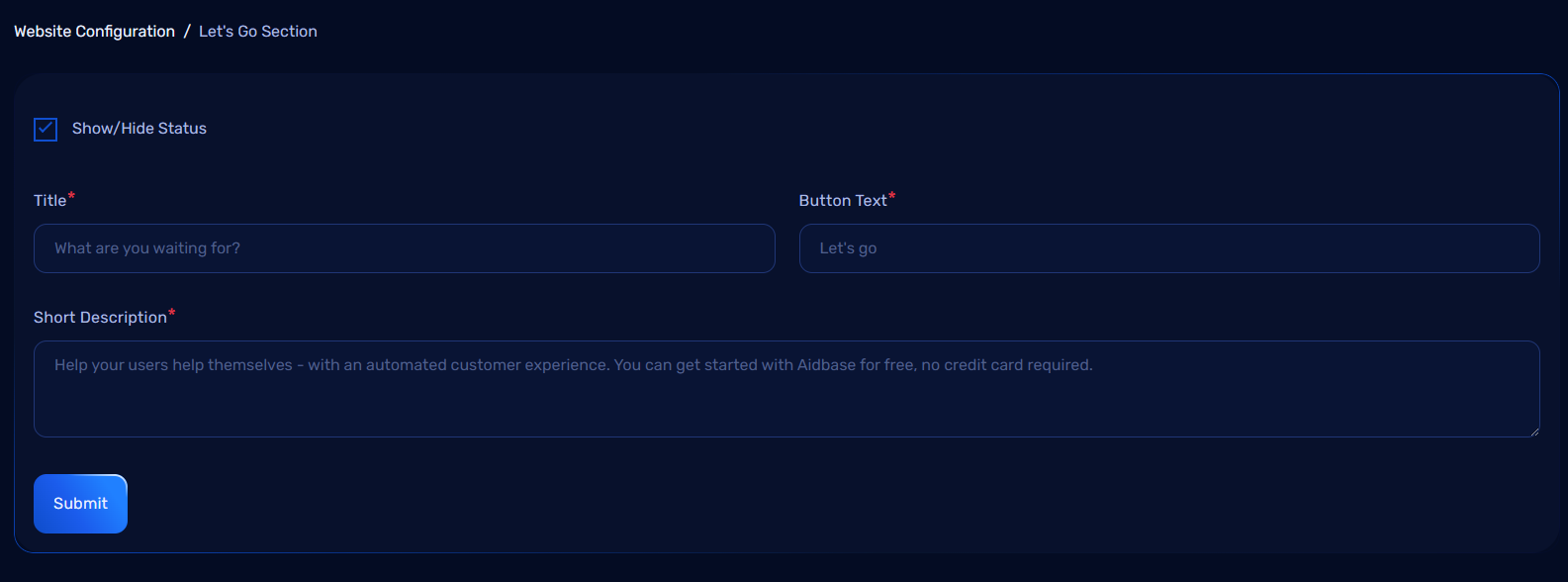
Fields to Update:
- Show/Hide Status: Toggle the visibility of the "Let's Go" section (Show/Hide).
- Title: Set the title for the "Let's Go" section.
- Button Text: Customize the text for the button in this section.
- Short Description: Provide a brief description for the "Let's Go" section.
This configuration allows you to manage the visibility and content of the "Let's Go" section on your website.
Let's Talk Section Configuration
This section is designed to gather contact information from users. Below are the fields required for this section:
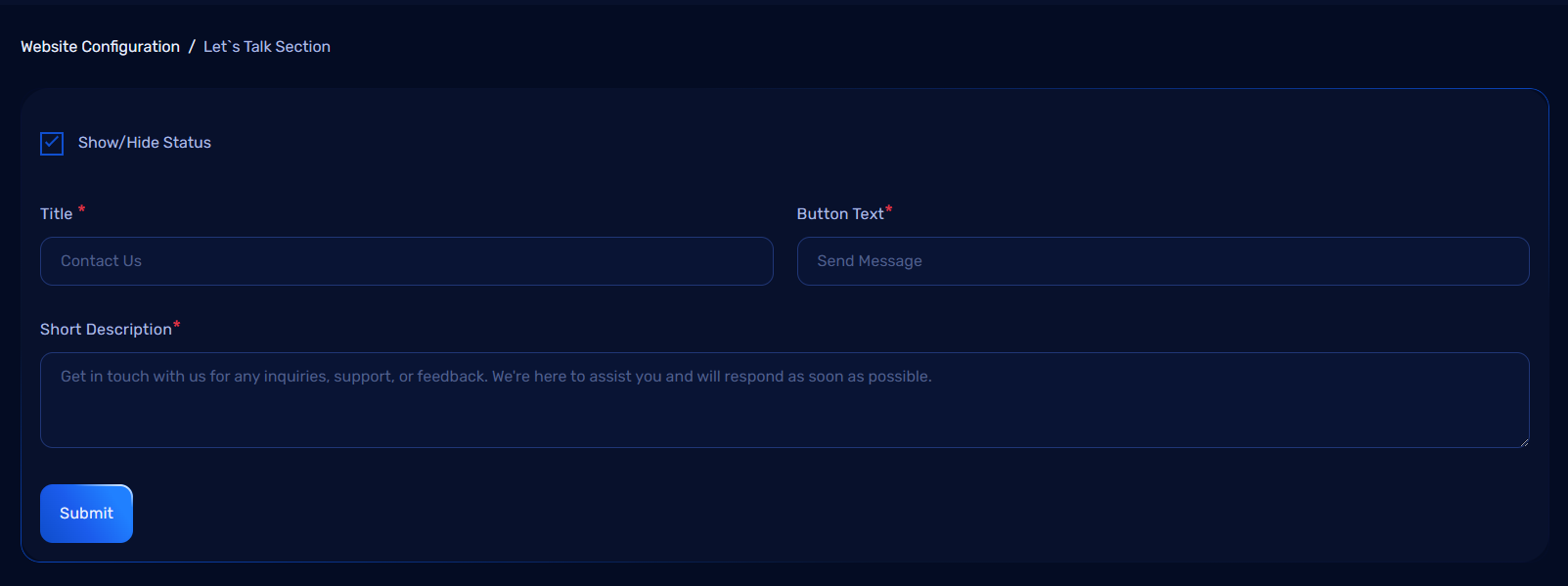
Fields
-
Title
A heading to introduce the contact form. -
Short Description
A brief message to encourage users to get in touch. -
Button Text
The text displayed on the button users click to submit their contact request.
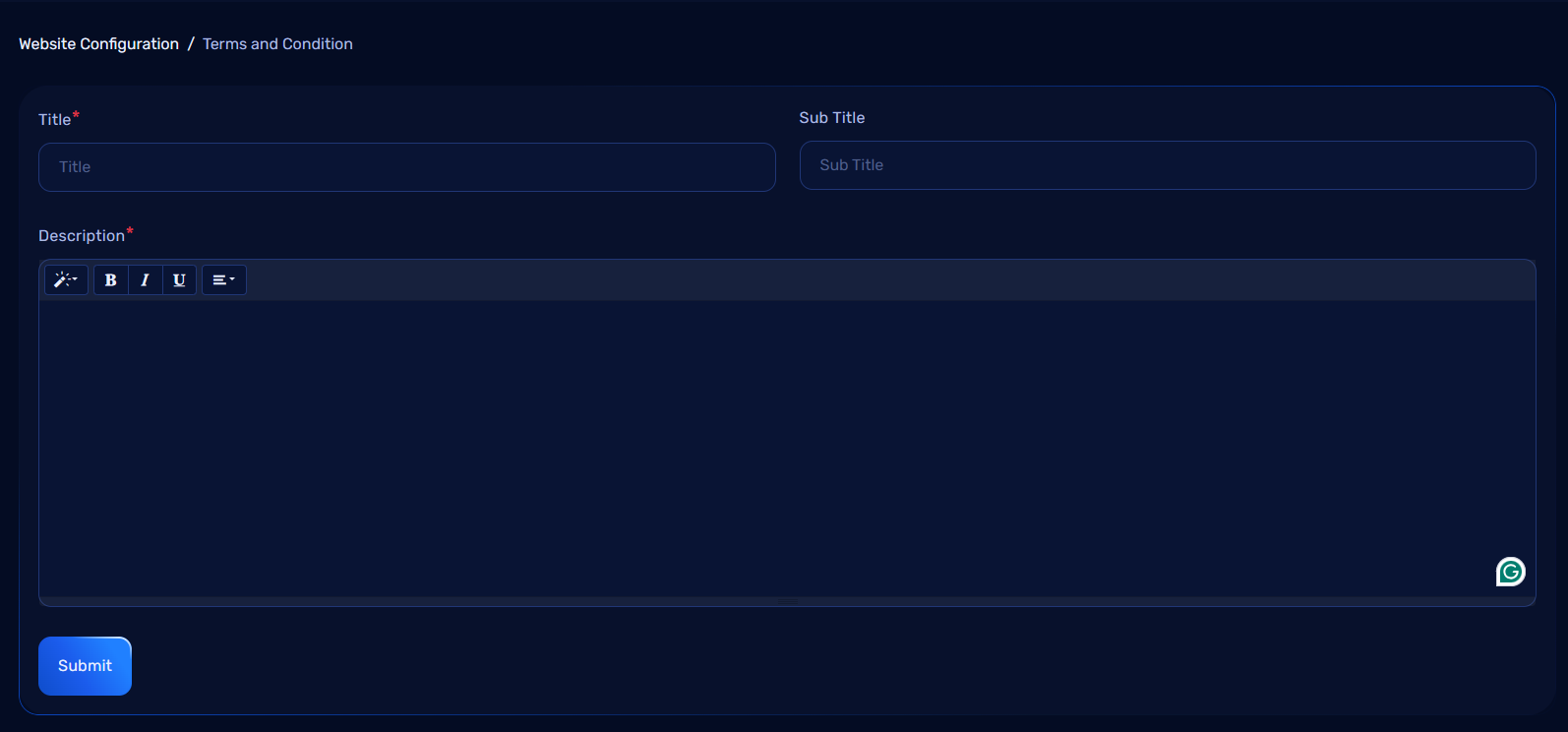
Terms and Conditions Section Configuration in Admin Dashboard
The Terms and Conditions section allows administrators to manage the terms and conditions content of the website. This section is important for displaying legal agreements and policies that users must accept when using the website or application. Administrators can update, edit, or remove terms and conditions content as necessary.
Terms and Conditions Overview
Features:
- Update, or remove the text for the terms and conditions of the application or website.
- Ensure users can view the latest legal policies and agreements.
- Maintain a centralized location for legal documentation.
Terms and Conditions Configuration Fields
The Terms and Conditions page can be configured with the following fields:
1. Content Information:
- Title: The main title of the terms and conditions page.
- Sub Title: The main subtitle of the terms and conditions page.
- Content: The full text or legal agreement for the terms and conditions.
- The content should include all necessary legal terms, privacy clauses, and usage rules.
How It Works
1. Updating Terms and Conditions:
- Admins can add or update the terms and conditions by filling in the Content field with the latest terms.
- After saving, the new or updated terms will be displayed on the website under the Terms and Conditions section.
Managing Terms and Conditions
1. Edit and Update:
- Admins can edit the terms and conditions content whenever necessary to ensure that it is up-to-date with legal requirements.
Benefits of Managing the Terms and Conditions Section:
- Legal Compliance: Keeping the terms and conditions updated ensures that the website or app complies with current laws and regulations.
- Transparency: Clearly displaying terms and conditions provides users with the necessary information about their rights and responsibilities.
- User Trust: A well-managed terms and conditions section helps build trust by showing that the platform is committed to user privacy and security.
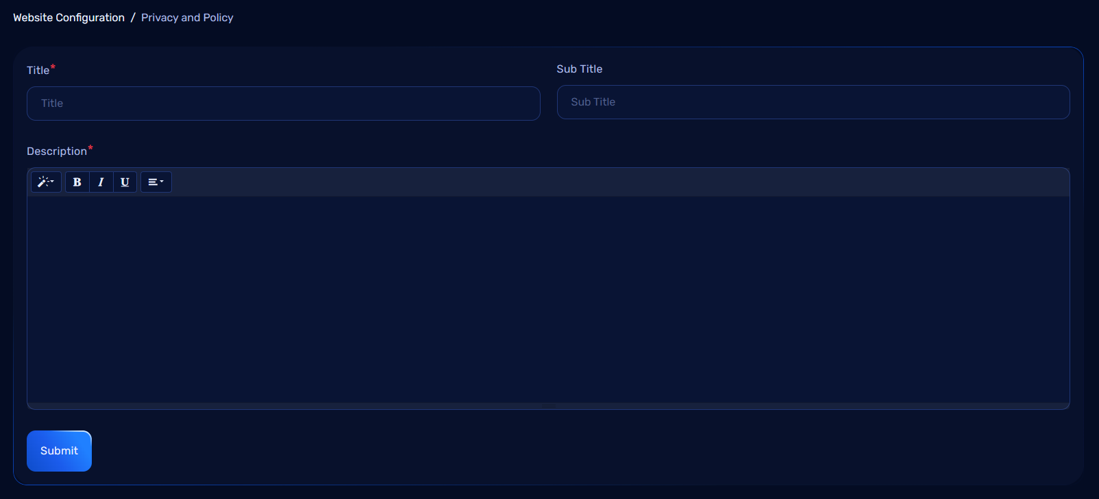
Privacy Policy Section Configuration in Admin Dashboard
The Privacy Policy section allows administrators to manage and update the privacy policy content of the website or application. This is a critical section for informing users about how their personal data is collected, used, stored, and protected. Administrators can update or remove the privacy policy content as needed.
Privacy Policy Overview
Features:
- Update, or remove the privacy policy content for the application or website.
- Keep users informed about their privacy rights and how their data is handled.
- Ensure compliance with data protection regulations (e.g., GDPR, CCPA).
Privacy Policy Configuration Fields
The Privacy Policy page can be configured with the following fields:
1. Content Information:
- Title: The main title of the privacy policy page.
- Sub Title: The subtitle of the privacy policy page.
- Content: The full text of the privacy policy that outlines how user data is collected, stored, used, and protected.
- The content should include:
- Data collection methods
- How the data is used
- User rights regarding their data
- Data retention policies
- Security measures to protect personal data
- The content should include:
How It Works
1. Updating Privacy Policy:
- Admins can add or update the privacy policy by filling in the Content field with the latest privacy practices.
- After saving, the updated policy will be displayed on the website under the Privacy Policy section.
Managing Privacy Policy
1. Update:
- Admins can edit the privacy policy content whenever necessary to ensure it complies with legal requirements and privacy best practices.
Benefits of Managing the Privacy Policy Section:
- Legal Compliance: Ensures the website or app meets legal requirements for user privacy and data protection.
- Transparency: Clearly communicates to users how their personal data is handled and the measures in place to protect their privacy.
- User Trust: A well-crafted privacy policy enhances user trust and demonstrates the platform's commitment to data security.